
10 tips to help you design using CMYK
Choice of paper can affect the colour of your work
Remember, the grade,quality, grain and colour of paper used will affect the overall colour of the finished job. Also, the light source under which you’re viewing the printed product can dramatically affect the colour tone.
Colour variance
If you select a colour from a Pantone colour swatch book and ask 100 printers to print it, you could well get 100 different tones. The age of your swatch book is also important as inks fade, some faster than others and if you rely on an old swatch you may find you get unexpected results.
Solid areas
This advice applies to both Litho and Digital printing. For images and solid areas, try to keep the cmyk breakdown to no more than 300% (when all the colour percentages are added together), especially when jobs are required with a very fast turnaround The more ink, the less chance it has to dry and the greater risk it may scuff and pick off.
Digital Press — Rich Black for solids and larger type
A good clean dense black for solids or larger bold text can be created using a mix of 100% black and 50% Cyan.
Litho Press— Rich Black for solids and larger type
For large, solid black areas and text over 36 points and to help prevent the black solid looking grey, Or if you require fine type out of the black, use a mix of 100% black and 50% Cyan. For good black solids use 'Rich Black' consisting of 30% Cyan, 30% Magenta, 30% Yellow, 100% Black. NOTE: For regular body text use Black only.
Litho Press— Clean dark grey solids
For a clean dark grey solid, consider using a high percentage of black and a mix of cyan. Bare in mind that subtle colours, especially in any large solid areas may be affected by other areas of strong colour on your design, such as an illustration or large area with a dominant colour. Remember that for speed and economy, printed designs are often laid up or for 'work and turn' with both the front and back. Therefore, if one side or area has a very dominant or subtle colour, other areas of colour may well be adversely affected. So allowances for this may have to be made.
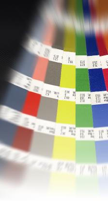
Choosing colours and tints
It is always good idea to choose your colour using a Pantone Matching Guide and not to rely on the colour picker or guide in the native program you are using. When you pick a colour in a swatch, look at the colours next to it on the swatch. If they are of a very similar four colour mix it will give you an idea how much the colour may vary on the finished printed job. If the colour either side on the swatch will also work with your design then you have built in some leeway.
Thin text, small text and thin lines
If you have small or thin text on your design, it is STRONGLY recommended that you do not use 4-colour black. Although, using a 4-colour rich black is recommended on larger areas, using small 4-colour text or very fine lines may result in poor results. For smaller black text, just use 100% black.
Solid areas, keep the CMYK breakdown under 300%
For images and solid areas, try to keep the CMYK breakdown to no more than 300% (when all the colour percentages are added together), especially when jobs are required with a very fast turnaround The more ink, the less chance it has to dry and the greater risk it may scuff and pick off.
Better quality results for fine type and lines
If you require very fine text and lines then your work would be best printed litho using a much higher screen value than normal. This should provide superior results on all areas of a job including the images, but very likely at an extra cost!
![]()